Sneaky UX – Deliveroo

I decided from now on to call dark patterns sneaky UX. I feel dark patterns is so evil, while most of the times it is not that dark.

Today’s sneaky UX comes from Deliveroo. A food delivery service in Europe.

If you start adding things to the basket, it will tell you the minimum is X for this restaurant.

screen-shot-2016-10-28-at-1-22-59-pm


If you click check out without meeting the minimum order price, you will get this.

screen-shot-2016-10-28-at-1-22-45-pm


I find it sneaky because it doesn’t tell me I could do this. I am sure many users who don’t meet the minimum order price either quit or keep adding things to their basket to reach the minimum.

This could be clearer.

Dark Patterns

Dark Patterns are User Interfaces that are designed to trick people.

There are many of those in apps we use everyday. There is no definite answer to what is considered a dark pattern.

A lot of times people argue whether something is a dark pattern. This discussion gets heated when the numbers prove to be positive for the business. Or the other way around.

I recently came through a few examples that I consider to be dark patterns that I am sharing in this post.

Airbnb

screenshot_20161007-031734

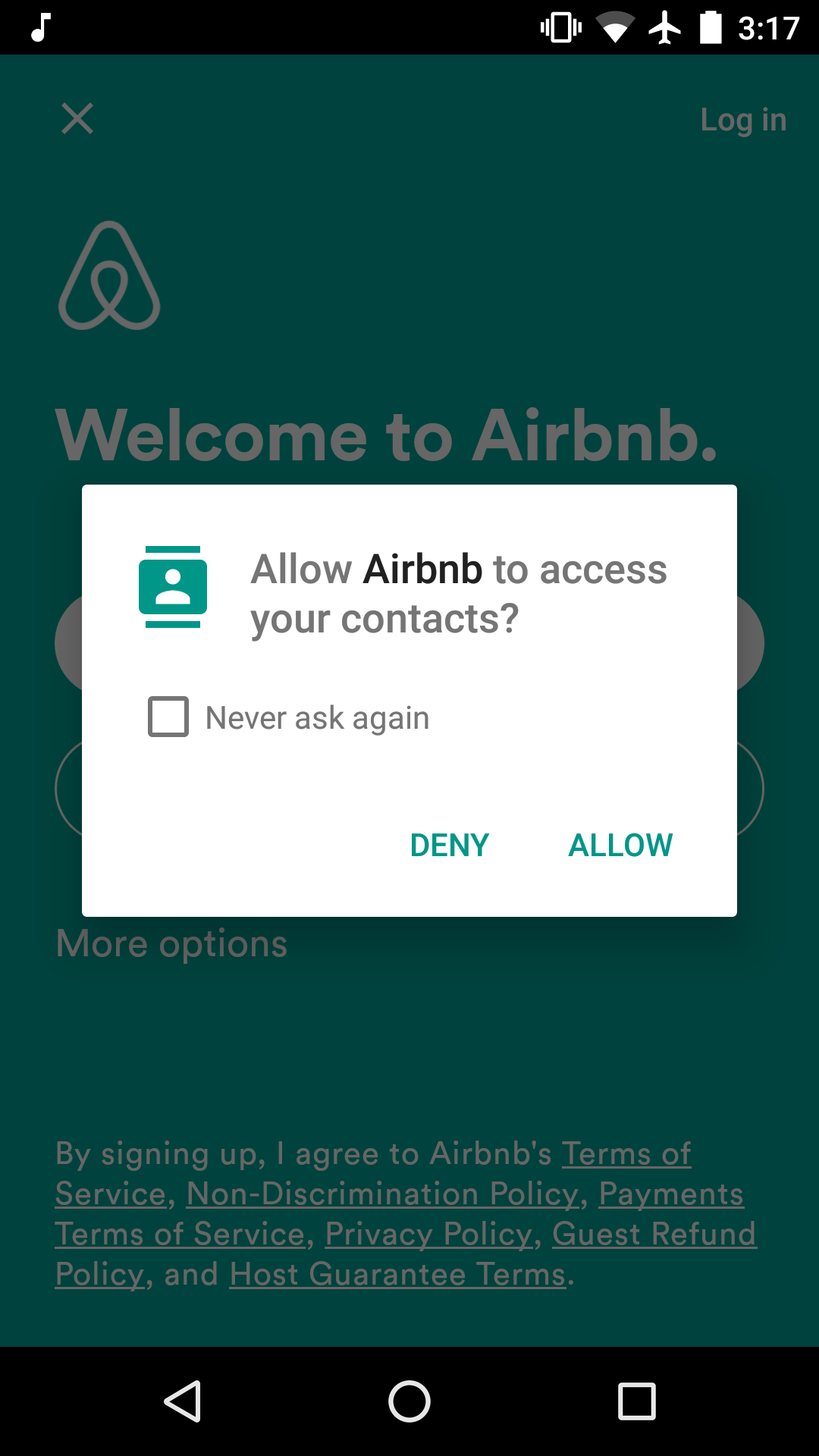
If you try to login with Google on Airbnb android app, it will ask you for permission to access your contacts. I think they use this later to know who on your network is using Airbnb, or to prompt you later to invite them to use the service.

The work around this was to do a forgot password, use my gmail account, create a password for the account, and login with my username and password. This way it won’t ask for access to my contacts.

Facebook

Facebook in my opinion is the master of forcing users to do what Facebook wants. The following screenshot I took when I was using mobile web last year before deleting my account.

Screenshot_2015-08-26-10-26-33.png

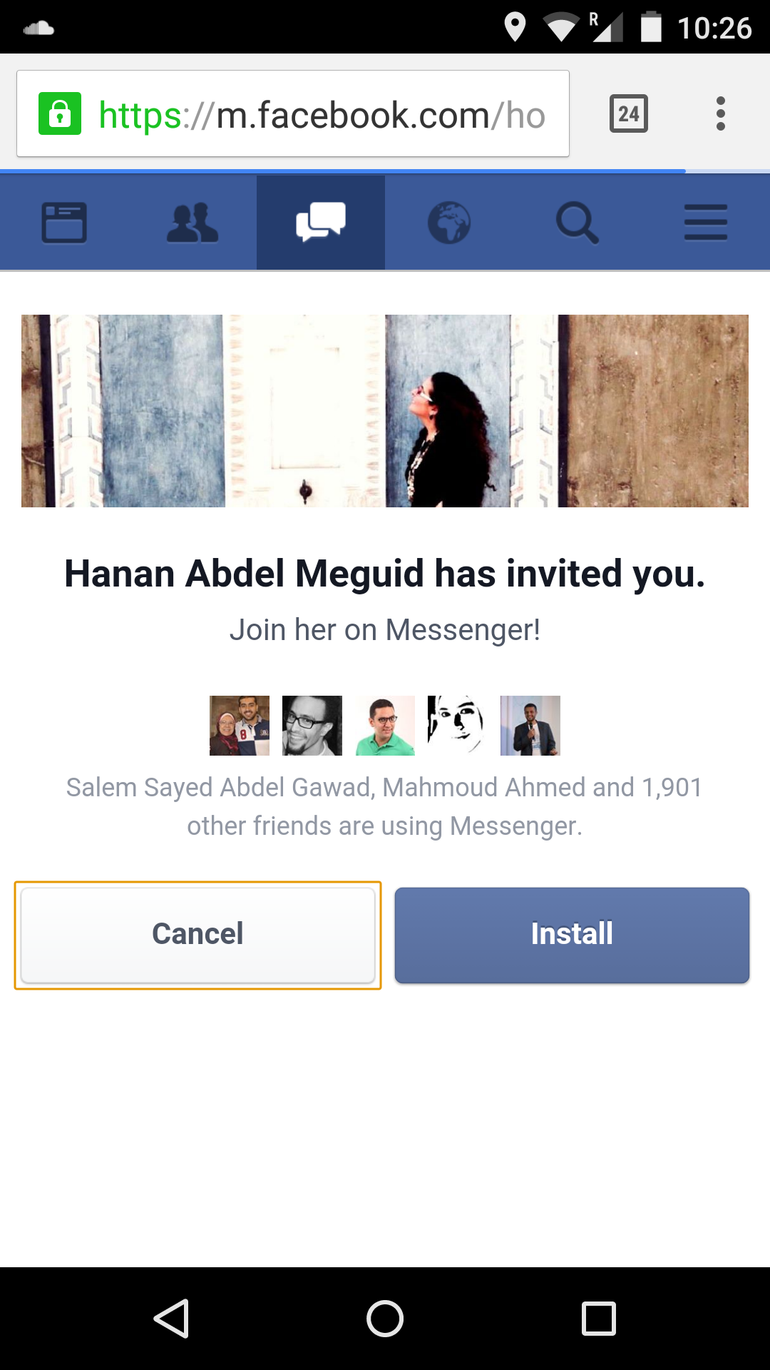
It was trying to mislead me into thinking that my friends are sending invitations to download the messenger app, while in fact if you just skip the message you will find your messages and you can use them just as if you have the app. I am sure this was very successful.

Easyjet

This one I stumbled upon recently while booking an Easyjet flight. After selecting the two flights, you are taken to a page where the first thing you see after seat selection is this part.

easyjet-3.PNG

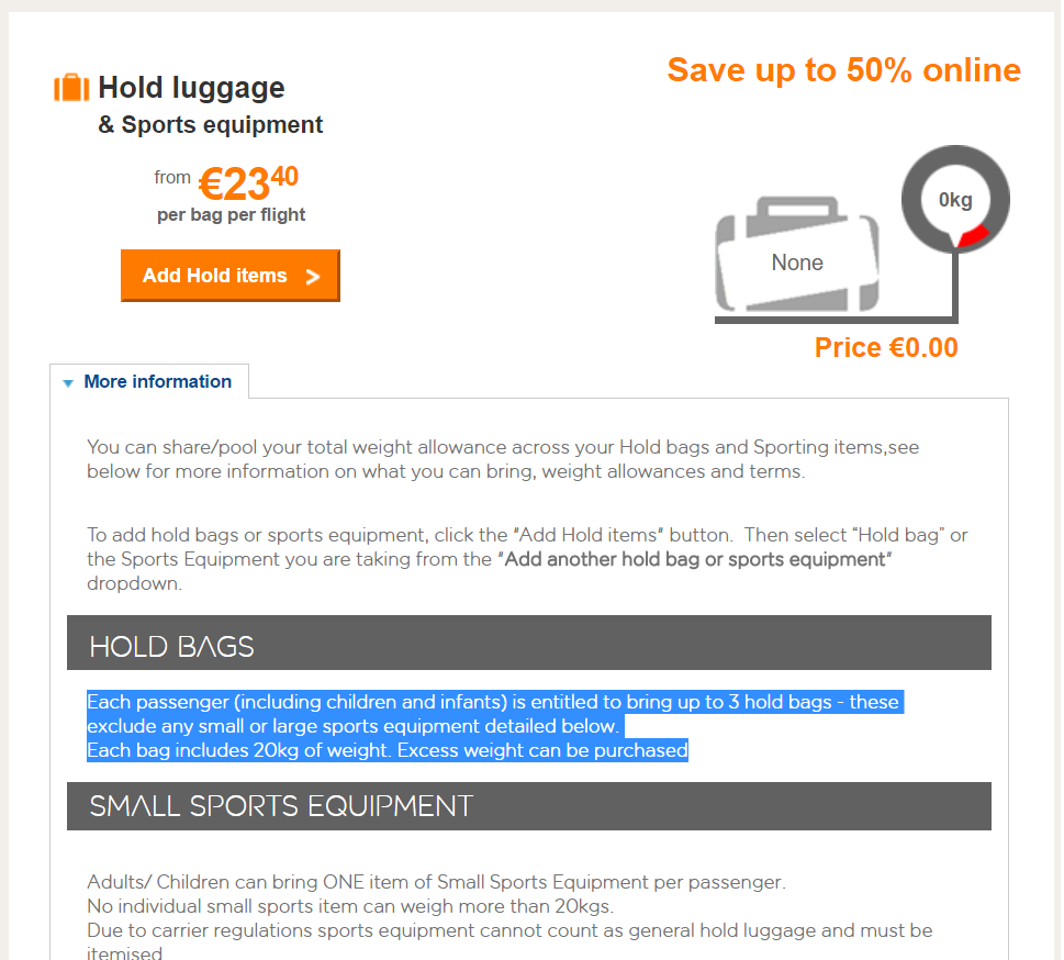
This made me think the flight doesn’t allow me any bags and I have to purchase the hold bags. Notice the name “Hold Bags”. It made me think hold bags includes/means carry on.

If you scroll to the very bottom, you will find that you can bring a carry on, but they name it Cabin baggage.

easyjet-2

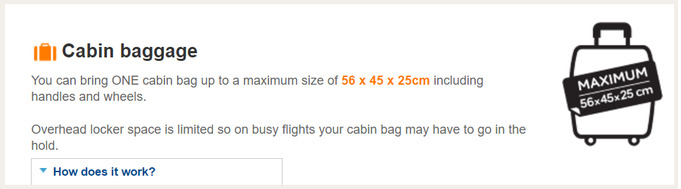
If you don’t scroll, you won’t see that you can bring a “Cabin baggage”, and you will think you have to purchase a “Hold Bag”. I wonder how much baggage sales increased after this implementation.


What dark patterns you saw recently? 


The white space at the end of my emails

I added the ability to receive email updates for this blog. I used MailChimp RSS campaign template. I simply give MailChimp a link to my blog’s RSS feed and it will email subscribers whenever a new post is added to the feed.

After creating the campaign I noticed there is a big white space in the email right at the end of the blog post content. I also noticed this white space on Mark Suster’s both sides of the table email updates. He uses MailChimp and the same template I use.

I contacted MailChimp support. They said the reason behind this space is the option in the campaign to resize images to fit the template. This option resizes big images to fit the template and avoid horizontal scrolling. It also resizes small images making them as wide as the template.

The latter was the cause of the issue. There is a one pixel image at the end of every blog post. This image is there for WordPress to be able to track how many people read the post through the RSS feed. Because MailChimp resizes small images making them bigger, it is taking this 1 pixel image and making it at least 600 pixels wide, hence the white space.

One immediate solution to this is to disable resizing images. The risk of this solution is having horizontal scrolling inside your email in case of using a big picture.

Another solution is to generate a custom RSS feed from the original one without the tracking pixel and submitting this to MailChimp as the campaign feed.

A third solution would be MailChimp fixing this from the beginning and making the templates just as any responsive template. And give users the ability to use images at the original size if they want (I bet this will be of small usage).

I decided not to take the risk with the first option, and was too lazy to implement the second option. So I decided to not do anything about it.

As the Dutch people say “Niet perfect is ook goed”.

Not perfect is also good!

You can subscribe to get email updates from this blog here.

Loading of Instagram vs Snapchat stories

I happened to be on a slow connection wanting to watch the current Snapchat and Instagram stories. 

Snapchat won’t let you open someone’s snaps before the app loads a few of them to avoid interruptions. Instagram will open the first story after loading the initial frame which sometimes open to you a frozen, waiting to load story.

Snapchat will start loading the rest of the snaps of the account while you are watching the first few. I think also Instagram does this. One key difference is that Snapchat won’t play a snap before it is fully loaded. Instagram does this like YouTube videos, the video loads while you are watching it (buffering). 

The problem with the Instagram way sometimes things freeze on the slow connection forcing you to close the story and reopen it. When you reopen it, Instagram considers you already watched the story you were loading and skips to the next one. 

This won’t happen on Snapchat because the snap won’t start playing before it is fully loaded. So even if Snapchat couldn’t buffer and you had to reopen the story, it will play the last one which you still didn’t watch. Unlike Instagram.

These small differences make me like the Snapchat experience more. I don’t have to take any further steps to ensure I watched the whole thing.

The developed world take some things for granted like a minimum connection speed. This is something I realized when I started working in Europe. Even when you simulate or run slow connection tests, most of the times you can’t get to a TE Data slow connection.

Errors that kill data driven decisions?

I am testing a new social app (under NDA) and I am in a group of PMs working for different companies, someone asked this interesting question

What according to you are errors that kill data driven decisions?

What I learned in the past year since I stepped into real product management at booking.com is that there are two main errors that kill data driven decisions.

Opinions

Opinion is the opposite of data.

The problem with opinions is that sometimes it is hard to suppress your own opinion because you want to do something so badly so you either decide to ignore the data, or try to find data that supports your opinion (I call this data driven confirmation bias). 

It gets more problematic when the opinions come from someone higher up in the hierarchy (Your manager). You get into the dilemma of: Is she more experienced so probably she knows better? Will she not like it if I didn’t follow what she said?

Fortunately I saw this very few times and it never happened with me. Be careful with opinions.

Is the effect real?

We use data to validate our hypothesis. The question becomes: Is the effect of the change I am seeing through the data statistically significant and I can base a decision on? Or it is a random effect?

There will always be the probability of identifying unreal effect as statistically significant (false positive), however not questioning the significance you are seeing through the data might drive you to misleadingly taking decisions based on effects that aren’t real. Which eventually kill the data driven decisions.

Coursera Tube

I wish there was a mode of Coursera where I can watch videos of courses the way I watch a YouTube playlist.

I am interested in many topics but my commitment to them is different from one to another. Some I am willing to pay to get the verified certificate, others a non verified free certificate is enough, while some I am casually interested to the extent I just want to go through the videos or some of them. 

I just want to get a glimpse about the topic or extend my knowledge the way I follow a science channel on YouTube. No enrollment, no dates, no commitment, no strings attached.

Sometimes the enrollment button feels like a commitment, even if it is a casual enrollment. It will still show up on your history that you signed up for this course and didn’t finish it.

I think Khan academy does this greatly. You don’t have to sign up to start watching the courses. I hope Coursera and EDX do the same.

How Facebook recommends this random person you only met once

I wrote before about designing for creepiness, which is this simple idea that companies should inform users about why something is recommended to avoid freaking them out on how the service got to this info.

Recently in multiple conversations with people, it came to my attention that many are surprised by how Facebook recommended this person whom they only met once with nothing common.

For those who don’t know how it works, it is very simple. Facebook matches information from multiple sources to identify a person to recommend, then the software ranks those people based on a specific criteria that’s only known  to those inside Facebook, and decides which accounts to display.

So, here is a list of possible ways by which Facebook recommends friends (I don’t know which ones they actually use):

  • If you give Facebook access to your email contacts, it will match those emails with Facebook accounts and starts recommending users using Facebook with the same email in your contacts list.
  • If someone has just joined the network and started to get a lot of friends who are mutual with you, Facebook will assume you also know this person and will recommend him/her for you.
  • If someone is using the same computer to login to Facebook, Facebook might recommend friends of that user to you on the basis they might be mutual. (If you use multiple accounts on the same computer you will notice this).
  • Facebook owns WhatsApp, for WhatsApp to work it needs access to your phone contacts, and it uploads them to the servers. If Facebook knows that I have your phone number on my phone it can start recommending you to me and visa-versa.
  • If you and I meet in the same location everyday from 9-5 (Facebook knows that from our phone location, or the network we use to login to our accounts like work network). If one of us lists on their account where they work (Or even without that), it will consider us working at the same place and start recommending us to each other along with other work mates.
  • If we both attended the same event (Visited the event page, said attending or maybe..etc) then our GPS locations confirmed our location at the time of the event, it might start recommending us to each other.
  • If we are in a group picture with mutual friends, it will definitely recommend us to each other.
  • This one is interesting: If you stalk someone by visiting their profile, Facebook can start recommending you to this person.
  • If two friends have your number/email, one of them is your friend, Facebook will recommend the other one as your friend.

This is what I got on top of my mind, what other ways Facebook might be matching information to recommend you friends?

Designing for creepiness

I had my Facebook deactivated for 6 months, during which I visited Saudi Arabia and worked with a guy for three days. The main communication during this trip was WhatsApp.

Few weeks ago I reactivated my Facebook, few days later I found him as one of the recommended friends. I don’t have Facebook app on my phone so they can’t have access to my address book, but I have WhatsApp, which is owned by Facebook.

Today I had a friend asking me, how can she disable allowing Google to get access to her location. She said whenever she opens Google search she finds at the end of the page Google telling her where she is. When she opens Google maps it automatically opens on her neighborhood. She went so far to reinstalling windows but still couldn’t get rid of it.

I told her they are getting her location from her IP, and gave her a locate my IP link so she can get a better idea. And as for the Facebook case, I know how they got this guy, but not every Facebook user knows that WhatsApp is owned by Facebook and technically they can connect the missing pieces from Facebook to WhatsApp and the other way around.

With the explosion in data collection and ease of analyzing the data for smarter recommendations, users are losing control over what they are sharing not understanding how it can be used later. This leads to a bigger UX challenge where whenever a company is introducing a new feature specially in recommendation, it needs to reassure the user that their information is safe and there is nothing to worry about. Otherwise it is too creepy.

Signifiers for tweetstorms

A key design element to any object whether physical or digital is signifiers. Signifiers tell people how to interact with the object, unleashing its capabilities.

Affordances define what actions are possible. Signifiers specify how people discover those possibilities: signifiers are signs, perceptible signals of what can be done. – Don Norman, The design of everyday things.

It is surprising, how a company like twitter suffering from an engagement problem partly because of the 140 characters limit, yet users started using the product in a different way to overcome this problem by posting tweetstorms.

Tweetstorm is a series of tweets about the same topic, posted sequentially and mostly marked by their order. – Unknown

While twitter now supports tweetstorms by allowing users replying to themselves, there are no signifiers on the app nor the website that you can do this. I still see lots of tweetstorms where users post each tweet separately marked by a number instead of replying to the previous tweet to continue on the topic.

This problem leads to another problem which is making it harder for users to read the whole tweetstorm specially if it is from a user they are not following, because they can’t simply tap on the tweet and read the whole tweetstorm, instead they have to visit the person’s profile to read everything. Add to this if the tweetstorm is old and unlinked, it is very hard to reshare it whether on twitter or on any other platform as the users have to scroll back in the person’s profile until the time of the tweet to be able to read the storm.

Twitter, please fix this.

Figure 1

I was born with a rare disease that causes bones not to form properly making them very fragile and easily fractured. Growing up in Egypt with our medical system in pre-internet era made it harder to diagnose me correctly until I became 4 years old.

Fast forward 25 years, 20+ surgeries, and tens of fractures. I was watching a session by Andy Wiseman, the partner at USV ventures (I am an avid reader of Fred Wilson’s blog and a big fan). Andy was talking about one of their portfolio companies “Figure 1”. It is a medical photo sharing app for medical professionals where they can post pictures of patients or their reports (hiding the patient identity) and get immediate feedback from other doctors.

While I am not a medical professional, I wanted to see the app in action and searched for my case. I started reading the interactions and for example I learned that the types of my case are not sorted by severity but rather by when it was discovered.

Since my disease is rare, there is a bias in the medical community for not researching it, which is why in my opinion there isn’t much advancement with finding a cure.

Figure 1 would be great if the patient can be part of the doctor’s learning process. I don’t mind sharing my x-rays on the app. I already tried but it said uploading only allowed for medical professionals. I understand this is important to keep the platform as professional as possible and not slip into becoming a patient-doctor medical community.

However, I think allowing doctors to tag their patients upon their consent so that other doctors can reach out to the patient and ask questions. A disease doesn’t only affect the person body parts, but their whole life and the lives of their surrounding ones which is important learning for doctors.

I am always happy by what technology is making us capable of doing. I wished this app existed when I was getting fractured and no one knew what I had.