Dark Patterns are User Interfaces that are designed to trick people.
There are many of those in apps we use everyday. There is no definite answer to what is considered a dark pattern.
A lot of times people argue whether something is a dark pattern. This discussion gets heated when the numbers prove to be positive for the business. Or the other way around.
I recently came through a few examples that I consider to be dark patterns that I am sharing in this post.
Airbnb

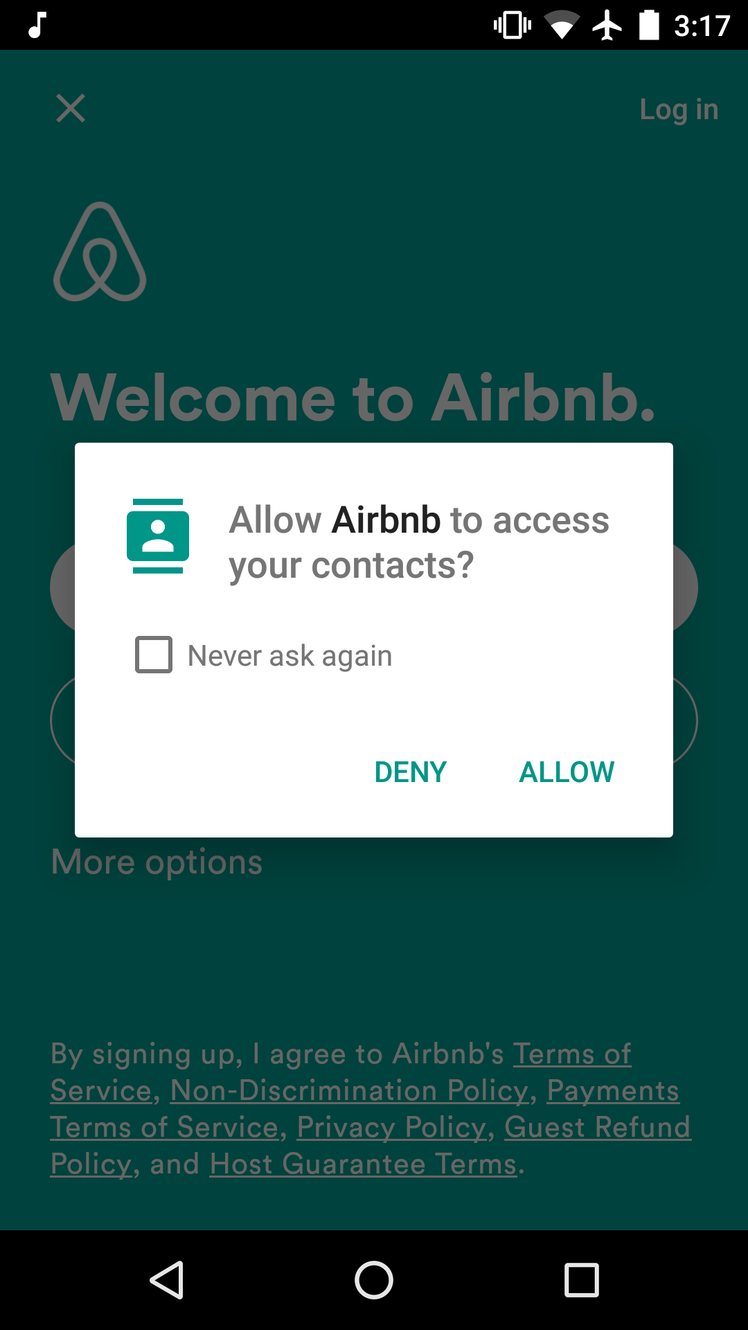
If you try to login with Google on Airbnb android app, it will ask you for permission to access your contacts. I think they use this later to know who on your network is using Airbnb, or to prompt you later to invite them to use the service.
The work around this was to do a forgot password, use my gmail account, create a password for the account, and login with my username and password. This way it won’t ask for access to my contacts.
Facebook
Facebook in my opinion is the master of forcing users to do what Facebook wants. The following screenshot I took when I was using mobile web last year before deleting my account.

It was trying to mislead me into thinking that my friends are sending invitations to download the messenger app, while in fact if you just skip the message you will find your messages and you can use them just as if you have the app. I am sure this was very successful.
Easyjet
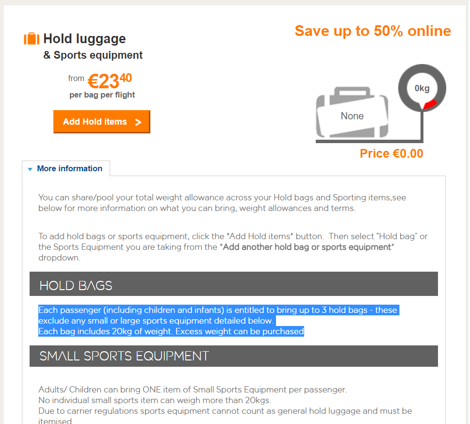
This one I stumbled upon recently while booking an Easyjet flight. After selecting the two flights, you are taken to a page where the first thing you see after seat selection is this part.

This made me think the flight doesn’t allow me any bags and I have to purchase the hold bags. Notice the name “Hold Bags”. It made me think hold bags includes/means carry on.
If you scroll to the very bottom, you will find that you can bring a carry on, but they name it Cabin baggage.

If you don’t scroll, you won’t see that you can bring a “Cabin baggage”, and you will think you have to purchase a “Hold Bag”. I wonder how much baggage sales increased after this implementation.
What dark patterns you saw recently?
